Showing posts with label 2011 topps. Show all posts

Some final business

Posted by Jonathan @ RGB Cards | Posted in , , ,

Well, it's finally over. The box has been busted, the cards have been sorted, and my want list has been updated. I ended up with around 280 cards, so another 40-something are required. Any help you can provide is lovely.


After pulling star after star that I didn't want, I finally got a Diamond Star card that is of interest to me. The checklist isn't great (for my purposes) as there's only three cards on there that I want, and this is one of them. Votto and Felix are the other two.


The checklist on the Topps 60 and the Kimballs, on the other hand, have been fantastic this time around and I've added many more to my want list. Here's an example - Johnny Bench in all the Reds double-knit glory.

I don't know if I've mentioned this before, but growing up in Cincinnati, I always got the sense that a person was either a Johnny Bench fan or a Pete Rose fan, but you really couldn't be both. You might appreciate the other for what they accomplished, but you really only warmed to one or the other. I was a Pete Rose fan growing up. That's not to say I mind it when I get a Bench card - it's always welcome. And given how Pete is now persona non grata in ToppsTown (and all of baseball), I guess I won't be pulling any new Roses in the forseeable future.

The category they chose for this Topps 60 card is very lame, however.


Finally, the last gold parallel of the box, and I'm certainly please by this. Rarely do I get gold parallels of players I give a shit about. They're usually Pirates, and that trend held firm again with this box. Prior to this Roberts, the only gold parallel I pulled - ever - that I was happy to see was a Felix Hernandez league leaders card that he had to share with two other pictures. So this one is pretty good. Then you flip it over and check out the serial number:


ZOMG!!!!@~``111!!@!!! IT'S A 1-OF-1!!!!!!!! I COULD GO ONTO EBAY AND SELL THIS FOR $$$$$$$$

No it's not. It's a 1 of 2011. Says so right on the card.

My newest Lincecum, plus some other cards

Posted by Jonathan @ RGB Cards | Posted in ,


I promised myself that I wouldn't use this opportunity to take a cheap shot at the Cardinals. But who am I kidding - of course I will! As you know, I am a sucker for cards that feature vintage uniforms. I should now amend that statement. I am a sucker for card that feature vintage uniforms that don't look like clown costumes.


On to some other cards. I can somewhat understand why Play at the Plate doesn't like the Hamilton card I featured earlier. After seeing this Lincecum card, I feel deflated. I've seen this card before. In fact, I have about 25 copies of it. What a let down - when cards of your favorite players don't live up to your expectations. I still think the Hamilton card is fantasic, though.


Hmm, I wonder who the inspiration for this Joe Mauer card was. Hint: consider who published the card. It's as plain as the nose on your face number on Mauer's back.


Finally, this Michael Pineda card was pulled one day too late. I considered adding him in the "young arms that are the hope of the franchise" post, but I didn't want to wait and I wasn't guaranteed to pull him, anyway. Sod's law says I'd get him the next day.

This is almost the end. I have four packs left, then comes the wrap-up post. Plenty of typing to come all weekend long.

Joy of a Completed Page (2011 Topps edition, part 2)

Posted by Jonathan @ RGB Cards | Posted in ,


Here's my first filled Series 2 binder page. I completed four of them tonight. Only 33 more to go...

Random thoughts from the Topps box

Posted by Jonathan @ RGB Cards | Posted in , ,

It's hard for me to write currently, because it's that time of year again - report card time. Thankfully, this year I only have twenty reports to write, and the expectations for how much to write are less than at my old school. But finding the proper motivation is still a necessity, and it usually means that all other writing activities get pushed to the wayside.

But I'm still opening cards, as it provides a bit of a welcome distraction. And in those packs, I'm still finding interesting things to talk about. For example:


Another year, another uniform for J.J. Putz. After six years of remarkable stability with the Mariners, this marks his fourth team in as many seasons. He'll probably get traded at the deadline or something like that.


Oh great - so how many copies of this card do I need now to complete all my collections?
(The answer, by the way, is four)


The Kimball minis checklist for Series 2 was full of great players for me to collect. Unfortunately, I kept pulling cards of people like Gary Carter. I've never really liked Gary Carter - there's something about him that rubbed me the wrong way, and I can tell you exactly what it is - that bubble-headed perm of his. I don't care that he no longer has it - the point is, he did. I feel the same way about Don Sutton and latter-day episodes of The Brady Bunch when Mike Brady traded in his respectable businessman cut for a swinging '70s perm.

Anyway, the Luis Aparicio is the first Kimball card on my personal checklist that I've pulled. All the rest will be available, and revealed in my Series 2 box break wrap-up post, due early next week.

On a final note, I won a new scanner/printer/copier at the school's fundraiser charity auction. The good news is, it's now a lot easier and less aggravating for me to scan cards. It's literally pushing one button and then changing file names to make my organisational format. So I don't feel dread in having to scan a big pack of cards, and should have a lot more illustrations soon.

Double your pleasure

Posted by Jonathan @ RGB Cards | Posted in ,

The packs I opened today included the promised hit, the base card of one of my favorite players (and an insert card as well), a Diamond Parallel of an exciting young prospect, and a redemption scheme that has frustrated me to no end. But I'm not going to show you any of those cards.

Instead, here are two cards of the hottest young superstar in the game. He's got two base cards in this series, and I got both of them. In the same pack!


Yes, it's a Jason Heyward hot pack. The card on the left is his proper base card, while the one on the right is his Rookie Cup card. This year Topps decided to print separate Rookie Cup cards instead of just putting the logo on the regular card, as they did in years past. I'm not a fan of that decision, because it takes away another spot in the checklist that could be used for either an established major leaguer or player that made a roster out of spring training (or, more likely, the third lefty in the Yankees bullpen). Why do Heyward, Buster Posey, Austin Jackson and Danny Valencia, for crying out loud, need two spots in the 2011 checklist? In Posey's case (and Neftali Feliz as well), between the regular card, the Rookie Cup, and the Rookie of the Year card, three spots in the checklist are being used. I like Buster Posey and think he's a great player. But three base cards are overkill.

Okay, rant over. Let's talk about the cards. The Rookie Cup card is fairly generic, just a picture of him leaving the batter's box. Maybe if it was on the basepaths, it would have been more evocative. The base card, on the other hand, could have been a great card. The ball in the air, about to go into J-Hey's glove (just like the Hamilton card). It's a frontal view of Heyward (so Dayf's happy) and because of that, you can actually see his face and the look of concentration as he follows the ball into his glove. From his body language, you can get a sense of the game situation. There's an air of casualness in his stance, so you have to think that there's nobody on base, and he's quite possibly about to make the third out of the inning. Heyward looks like he's about to make the catch and just keep on jogging, straight into the dugout. He might not even throw the ball back in. There's just one huge, glaring flaw. Can you spot it?

That damn electronic advertisement that Heyward is standing in front of is ruining the shot! It's an awful background, and makes Heyward look like he's posing in front of the world's biggest Lite-Brite. Not even a good Lite-Brite - it looks like one that's missing half of the pegs. Time and time again, those electronic ads and scoreboards are ruining baseball cards. Topps has never shown any reluctance to airbrush or Photoshop their pictures. Why can't they do us a favor and airbrush in a normal outfield wall?

Uniform Back Cards (Part 7 in a series)

Posted by Jonathan @ RGB Cards | Posted in , ,

Yesterday, I posted what I thought was the worst card of 2011 Topps. And yes, Dayf, I was serious. The choice of a white-gray background on a card that has a white border is an inexcusable decision on Topps' part. Had the series featured full-bleed photography, or a colored border, then the background might have looked good, because I agree that there are too many generic shots in cards today. But the hoodie is still a deal breaker. Call me crazy, but I like to have the players on my baseball cards wearing, oh, I don't know, baseball uniforms!

But today I am not here to bury Topps, but to praise it. Because I have found one of the better cards in the series. It's certainly good enough for inclusion in the Uniform Back Series. I present card #650, Josh Hamilton:


The photographer captured Hambone in mid-stride, and I can say with absolute certainty that this picture was taken a split-second before he made the catch. I mean, look at that ball - there's no way it didn't go in the glove. Sure, we're talking about the Rangers, but this isn't a Jose-Canseco-ball-off-the-melon situation.

That it's an action shot instead of a "just-standing-around" picture is just one way that this card succeeds where the Fred Lewis card fails. Another is the colors. The predominantly black (with a touch of dark blue) background contrasts well with the white border. You don't get the feeling, if only for a second, that the card is horribly miscut or a printing flaw. And speaking of contrast, look at how well Hamilton's uniform, particularly his bright white pants, stand out from the outfield wall. Even the "404" marking the center field distance complements, rather than competes for attention.

Of course, this is a Uniform Back card, and a fine example at that. You can clearly see the player's name and number. The fact that uniform number and the distance on the outfield wall are in the same font ties it all together nicely. A big thumbs up to Topps for this card.

In other business, I don't know if I got a 60 Years of Topps "hot box" or if I'm just uncovering my allotment early, but I like the results so far. In eight packs, I've gotten four 60YOT cards, which is a good return for someone collecting the set. The best of the bunch? Well it's really no contest:


A 1965 Frank Robinson, in his last season with the Reds. I'll be back again tomorrow with some more from Series 2. Please be sure to vote in my poll if you haven't already. How do you organise your player collections?

Is this the worst card of the year?

Posted by Jonathan @ RGB Cards | Posted in , ,

Well, I bowed to public opinion and opened the box of MLB Series 2 cards first. The first four packs were a mixture - I got the infamous Domonic Brown "twink that isn't really a twink" card. I got a Pirates diamond parallel card (shocker!) and a decent mix of Reds, White Sox and Orioles (including Paul Janish and Chris Tillman). I also got what has to be the worst card in the 2011 set. Number 517, Fred Lewis:


How to I loathe thee? Let me count the ways. First, the picture was taken at spring training, and Fred is wearing a hoodie. A hoodie! Not even a warm-up jacket. Frankly, I would have preferred a dodgy airbrushing job to a hoodie. And what appears to be slacks.

Secondly, the sky was very gray that day. It's probably why Fred was wearing the hoodie in the first place. But when you combine that with the white border that surrounds the card - it all blends together. Honestly, when I saw the card in the pack, I thought it was horribly miscut. Imagine the horror when I realised the card is as it's supposed to be. What a craptastic design job.

Finally, the picture just isn't great. It looks washed out (maybe because of the extremely gray sky) and you can't even see Fred's face that well behind the sunglasses, hat pulled down and side-on view. Not to mention he has two baseball bats in front of his head. The fact that he's even wearing sunglasses begs another question - if it was that overcast, why was he wearing sunglasses, anyway?

I refuse to believe that was the best picture Topps took of Fred Lewis in spring training this year. Even if it was, they should have realised the pickings were slim and trotted out the old airbrush. Fred Lewis, like all ball players, deserves a real baseball card, not a half-assed attempt. More importantly, so do we.

My first poll

Posted by Jonathan @ RGB Cards | Posted in , ,

Real life always seems to get in the way. I've got a stack of cards that need scanning, but no time to do it and an scanner that is not talking to my computer due to some sort of lover's quarrel (ah, silicon love). The result? Nearly a month without posting. Egads!

To make it up to you, my wonderful readers, and to celebrate the 50th follower on the website, which apparently happened at some point during my absence, I have an RGB Cards first. No, not a contest. Or a group break. How does a poll sound? Look to your right. Try to ignore the box for The Belt that hasn't been updated in a while. I'll have to fix that soon.

I have ordered, from Orange County Sports Cards, two boxes. One is 2011 Topps Pro Debut Series 1, the other is 2011 Topps Baseball Series 2. The package has apparently cleared customs, according to the USPS tracking site, and should arrive at my house most likely within the week. It should make a welcome distraction as I work on report cards this week.

I also ordered some Ultra Pro binder pages from an eBay seller here in Australia, since I was flat clean out of them. Unfortunately, I can't read too well. I thought I was ordering four boxes of the pages. Instead, I was ordering four lots of ten sleeves each. I should have known that seven bucks, shipped, was too cheap for a box! (As a point of reference, a box of 100 usually costs me 50 bucks at my "L"CS. They are damned expensive here in AUS. No wonder I try to bring back as many as I can whenever I visit America).

So because of this, I only have enough binder sheet to open one box right now, either the Pro Debut or the Series 2. Which box should I open first? And which will have to wait until I can order more Ultra Pro sheets? I leave my fate in your hands.

In the spirit of Chicago politics, and the All-Star game: vote early, and vote often. The poll will be open for a week, or until the package gets here. Whichever is sooner.

Image credits: 
toddmckimmey.com
Pro Football Hall of Fame
Associated Press

Contest loot - Play at the Plate

Posted by Jonathan @ RGB Cards | Posted in ,

Back in March, I won a contest over at Play at the Plate, and the prize was a hanger pack of Topps Series 1. After busting my jumbo box, then only getting one card I needed to complete the set from the blaster I purchased from Amazon, I didn't really hold out hope of putting too big of a dent in my want list with this pack.

Boy was I wrong. Of the 72 cards in the pack, 11 of them were cards that I needed, including eight base cards. It was quite a good score, I must say. Here's the results.

First, the base cards. This might be the only time you ever see Arthur Rhodes get pride of place over Roy Halladay and the recently retired Manny Ramirez (why couldn't I have gotten that card a month ago?). But let's face it - Arthur Rhodes was awesome for the Reds last season, while Manny dropped a big steaming turd for the White Sox and Halladay broke the Reds' hearts in the playoffs. I really shouldn't be showing those two cards at all, come to think of it.


I needed the Rhodes for my Reds team set. The next three cards, plus the two horizontal cards are all ones I didn't have in my collection (out of 20 - an excellent pickup) while the two (Duensing and Greinke) are cards that I did have, but had foil problems. Now I have pristine cards for those players in my binder.


It was a real mixed bag on the inserts. The Bobby Abreu card is one I needed for the 60 Years of Topps, and the presence of Barry Larkin saves the Diamond Duos card (plus, I didn't have it), but it would figure that I already had that Big Hurt Topps 60 card (*sigh*). I don't care about the Kimball Champions and CMG reprint sets, so those cards are available. But hey, Arthur Rhodes is back and he's bedazzled this time!


The hook for this particular product line is the presence of "Blue Sapphire" cards, available only through Wal-Mart. There's 15 cards on the checklist, but only one player on it, Ichiro, that I really cared to collect. So I knew the odds were slim. And I was right.

Cards from the pack that are available for trade:
Base: 2, 3, 15, 20, 32, 33, 46, 50, 54, 60, 61, 63, 69, 73, 76, 93, 98, 105, 109, 110, 136, 149, 154, 156, 161, 168, 178, 182, 184, 185, 187, 188, 191, 194, 216, 217, 221, 222, 224, 242, 247, 256, 265, 274, 293, 295, 299, 303, 307, 310, 311, 321, 323, 327
Vintage Legends: CMGR-17 (Jimmie Foxx)
Topps 60: T60-35 (Frank Thomas)
Kimball Champions: KC-5 (Carlos Gonzalez)

Topps Town: TT-34 (Felix Hernandez)
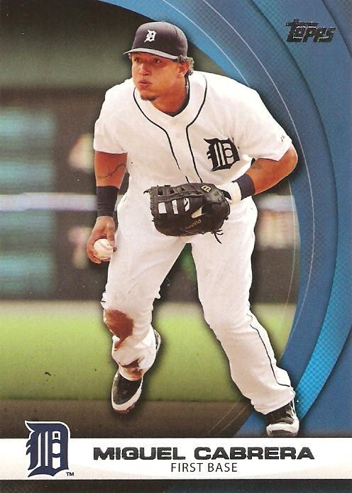
Wal-Mart Sapphire: WHP15 (Miguel Cabrera)

Ideally, I want a card from my Topps 60 want list for the Frank Thomas, from the Kimball Champions want list for the CarGo, and the Ichiro Sapphire Blue card (WHP13) for the Miggy, since that is the only player on the Sapphire checklist I care about having. I'd also be happy with an Ichiro Red Diamond from Target, an Aroldis Chapman Blue Diamond from Wal-Mart or Ruby Red from Target, or a Tim Lincecum Purple Diamond from Toys R Us.

Thanks for the prize, Brian. I looked forward to the end-of-year contest, now that I'm qualified for it!

Little Package of Goodness - Dawgbones

Posted by Jonathan @ RGB Cards | Posted in , , , , ,

When I got back from my holidays, there was a package waiting in the mail for me from Richard over at Dawgbones, a Phillie Fan. He and I had been working on a trade, my first involving cards from 2011 Topps. Thankfully, I had a lot of cards that he needed for his collection, and he had more than a few to fill some gaps in my set. While these cards aren't all of them, they are a representative sample.


Richard sent about 15 of the 2011 base cards. These three were the ones that I didn't have, although there were also quite a few White Sox and Orioles for my team sets as a few cards that were upgrades from the damaged cards I pulled from my box. But thanks to the Dawg, I now have Messrs. Wright, Conger and Revere in the binder.


There were also some insert cards - once again, I'm being a fool and attempting to collect the 60 Years of Topps set, even though I haven't finished collecting last year's Cards Your Mom Threw Out (a fact shown by the Maris card from that set that I needed). Thankfully, the Diamond Duos set appears to be a much more reasonable target, even though the pairings are a bit strange. Hornsby and Holliday? Outside of the uniform, there doesn't seem to be much in common. Ramirez and Stanton are at least teammates, so they're a duo that shares a diamond.


As I was hammering out the trade details with Richard, I pulled out my 2010 Allen & Ginter binder and realised that I have a lot of work to go on this set. Thankfully, he had 13 cards from A&G to put in the binder, so I only have a great deal of work to go now.


Now for the big-ticket items. As you might remember, I had pulled a Matt Holliday manu-patch out of my 2011 blaster. I also pulled a Hank Greenburg short print so it wasn't a total loss. Thankfully, not only did Richard want my manu-patch (since he collects players who were the No. 7) but he had an Ichiro patch card from the same series to trade. In fact, I think this my have been the impetus for the trade in the first place.


Another thing that Richard collects is currency. And for the price of AUD 3.85 (approximately US$4.00), which is one of each coin (that's right, we have a dollar and a two-dollar coin, and they're lovely), he was kind enough to throw in this card. It's not a manu-hit, it's the real thing. Ichiro's 2007 Night Before the All-Star Game batting practice jersey, all cut up and preserved for posterity. I like the color.


Besides the cards, which I was expecting, were a few things that I wasn't. First up, these three Fatheads, which will find a place on the front of their respective team binders. Now I'm going to have to chase up the Orioles and the Athletics, too.

But the best thing in the package wasn't even a card, or a Fathead. Richard included a really, really nice note that let me know how much he enjoys reading my blog. It was very touching because, as I've said before, I write this for all of you. I enjoy getting to share my collection, and my opinions on the game, but it's the comments and the interaction with you guys that keep me writing.

He specifically mentioned my Travels With Raleigh series, which was abruptly cut off due to our arriving safely in Derby and not having any internet access up here for a few weeks on my arrival. By that point, it was time to start writing about cards and the new baseball season again. But I should finish the series, because there's a few more stories to tell. Richard's note is the impetus to get that finished. Please hold me to this.

Thanks for an absolutely great trade, Richard. I hope to complete another one with you in the future!